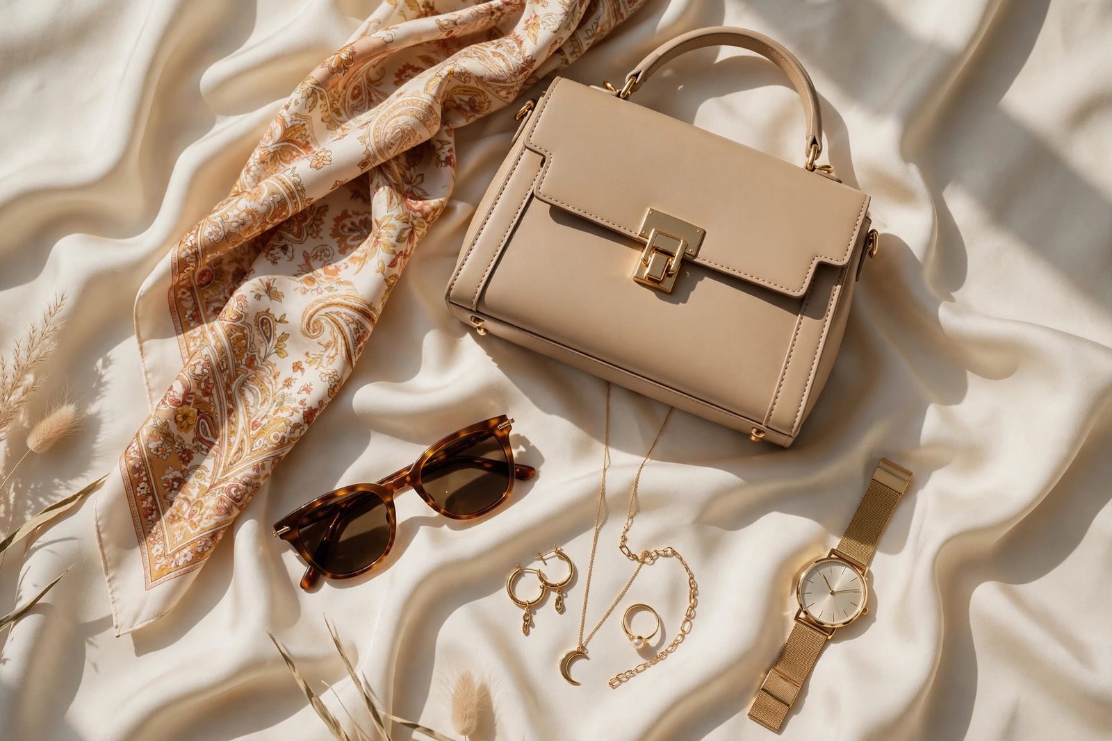
Our most-viewed pin of all time — 82,000 views and counting — is a colour guide. Here’s the full breakdown of the six high-contrast pairings our community can’t stop saving, and how to wear each one.
Why colour pairing matters more than ever
In 2026, the “clean girl” all-beige era is giving way to deliberate contrast. The right pairing makes even simple pieces look expensive — it’s the fastest upgrade in fashion, and it costs nothing.
The six combinations
- Emerald + Camel — jewel tone against warm neutral; made for workwear and evening alike.
- Rust + Navy — autumnal depth with a cool anchor; try a rust knit over navy trousers.
- Mauve + Dark Brown — soft meets rich; unexpectedly elegant for daytime.
- Chocolate + Cream — the 2026 neutral pairing; tonal, calm, endlessly wearable.
- Olive + Soft Black — utility edge without harshness; perfect for streetwear bases.
- Blush + Charcoal — one whisper of colour against a strong dark; evening-ready in seconds.
Test any combo in 10 seconds
Hold the two fabrics together in natural daylight, at arm’s length. If your eye moves comfortably between them — neither colour “shouts” over the other — the pairing works. If one disappears, adjust the proportions, not the colours.
Stylist tip: use the 60-30-10 rule — 60% dominant colour, 30% secondary, 10% accent (usually in accessories). It works for outfits, rooms and Pinterest boards alike.